

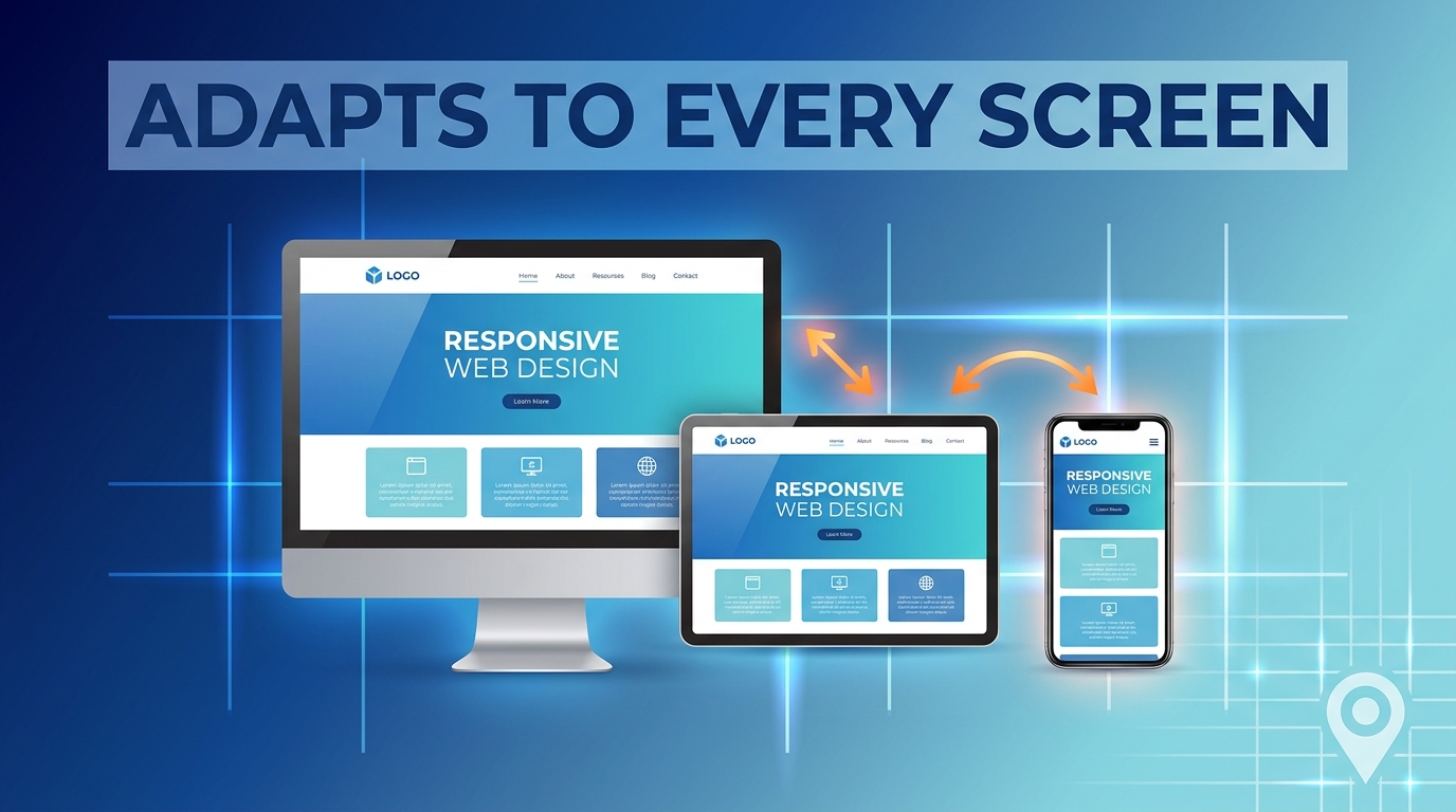
Responsive Web Design Glendale: Why Your Website Must Work on Every Screen
Your website may look perfect on a desktop computer, but what happens when someone visits it from an iPhone, Android phone or tablet?
If visitors have to zoom in, scroll sideways, struggle to read text or hunt for the contact button, you may be losing potential customers before they ever learn what your business offers.
That is why responsive web design Glendale is more than a visual feature. It is an important part of creating a website that works for real users across different devices and screen sizes.
A responsive website adjusts its layout, images, navigation and content based on the screen being used. The goal is simple: visitors should be able to use your website comfortably whether they are on a desktop, tablet or phone.
What Is Responsive Web Design?
Responsive web design is an approach to website design that allows a site to adapt to different screen sizes.
Instead of creating one fixed layout for desktop users and another completely separate website for mobile users, a responsive website uses flexible layouts and elements that adjust as the screen changes.
For example, a desktop website might display several navigation links across the top of the page. On a smartphone, those links may move into a compact menu.
Images can resize. Columns can stack. Buttons can become easier to tap. Text can adjust to remain readable.
The website is still the same site, but the experience changes to suit the device.
Why Does Responsive Design Matter for Your Business?
Your website is often one of the first places a potential customer interacts with your brand.
If the experience is frustrating, visitors may leave before contacting you, requesting a quote or learning more about your services.
A responsive website can help make important parts of the customer journey easier.
Easier navigation
Mobile visitors shouldn't have to pinch and zoom to find your services or contact information.
Responsive layouts can reorganise navigation so important pages remain accessible on smaller screens.
Better readability
A desktop layout can have plenty of room for large headings, long sections and multiple columns.
That same layout may become difficult to read on a phone.
Responsive design helps content fit the available space without forcing visitors to constantly adjust the screen.
Easier interaction
Forms, buttons and other interactive elements need to work well with touchscreens.
A button that is easy to click with a mouse may be frustrating to use with a finger if it is too small or too close to other elements.
A more consistent brand experience
Your website should feel like the same business regardless of how someone accesses it.
Responsive design helps maintain your branding, messaging, images and overall visual identity across different devices.
Responsive vs Mobile-Friendly: Is There a Difference?
The terms are sometimes used interchangeably, but they can describe slightly different ideas.
A mobile-friendly website is generally designed to work reasonably well on mobile devices.
A responsive website goes further by dynamically adapting its layout to different screen sizes.
For example, imagine a desktop page with three columns.
On a responsive website, those three columns might automatically stack into one column on a smartphone.
This gives the visitor a layout that is designed for the available screen rather than simply shrinking the desktop version.
What Should a Responsive Website Include?
Good responsive design isn't just about making everything smaller.
A professional website design project should consider how the entire experience changes across devices.
Important elements include:
Responsive navigation
Menus should remain easy to access without taking over the screen.
Flexible images
Images should resize appropriately rather than overflowing the page or slowing it down unnecessarily.
Readable typography
Text should remain comfortable to read without excessive zooming.
Touch-friendly buttons
Calls to action should be large enough and spaced appropriately for touchscreen use.
Flexible layouts
Sections should reorganise naturally as the screen becomes smaller.
Mobile-friendly forms
Contact and enquiry forms should be easy to complete from a phone.
Clear calls to action
Visitors should quickly understand what they can do next, whether that means calling your business, requesting a quote or booking a consultation.
Does Responsive Design Affect Website Performance?
It can.
Responsive design itself doesn't automatically make a website fast. Poorly optimised images, unnecessary scripts, inefficient code and weak hosting can still create performance problems.
However, responsive development gives designers and developers the opportunity to think carefully about how content and assets are delivered across devices.
This matters because Friday Marketing already treats website performance as part of its broader web development approach, alongside user experience and conversion-focused design.
Performance should therefore be considered alongside responsive design rather than treated as a completely separate concern.
How Responsive Design Can Support Conversions
Imagine a potential customer finds your business through Google or a social media post.
They click your website from their phone.
If the page loads properly, the service information is easy to understand and the contact button is obvious, the visitor has a clear path forward.
Now imagine the opposite.
The page is difficult to read. The menu doesn't work properly. The form is awkward. Important information sits off-screen.
Even if your marketing successfully brought that visitor to the site, the website may make it harder to convert them.
Responsive design cannot guarantee more leads or sales, but it can remove unnecessary usability problems that stand between visitors and your calls to action.
What About Desktop Users?
Responsive design doesn't mean designing only for smartphones.
Desktop users still matter, particularly for businesses whose customers research services from computers at work or home.
The goal is to create a flexible experience that works across the full range of devices.
A good responsive website should therefore be tested at multiple screen sizes rather than simply checking whether it looks acceptable on one phone.
Signs Your Website May Need Better Responsive Design
Your website could benefit from a responsive review if:
- Visitors have to zoom in on mobile
- Text is difficult to read on smaller screens
- Images extend beyond the screen
- Buttons are difficult to tap
- Your navigation is confusing on phones
- Forms are frustrating to complete
- Important content disappears or becomes difficult to find
- The desktop version looks good but the mobile version feels like an afterthought
- Customers regularly mention problems using your site
- Your website hasn't been updated for several years
You don't necessarily need a complete rebuild for every problem.
Sometimes individual design or development improvements can address specific issues. In other cases, an older website may be better served by a complete redesign.
Responsive Design Should Start Before Development
Responsive design works best when it is considered from the beginning of a website project.
Before development begins, a design team can think through:
- Which information matters most?
- How should navigation work on mobile?
- Which sections should stack?
- How should images behave?
- Where should calls to action appear?
- What happens to tables or complex layouts?
- How should forms work on smaller screens?
Planning these details early can prevent expensive redesign work later.
Choosing a Web Design Company
If you're searching for a web design company Glendale, don't only look at desktop screenshots in an agency's portfolio.
Ask to see how websites perform across different screen sizes.
You can also ask:
- How do you approach mobile-first design?
- How do you test responsive layouts?
- How do you handle images and media?
- How do you optimise mobile performance?
- How are forms tested on phones?
- How do you make sure important calls to action remain visible?
- Will the website be easy to update later?
A strong agency should be able to explain its process clearly rather than simply promising that the finished website will be "mobile-friendly."
Responsive Design and SEO
Responsive design can also support a better technical foundation for search visibility.
Search engines need to understand and crawl your website effectively, while users need to be able to access and use your pages.
Mobile usability, page performance, content structure and technical implementation can all contribute to the overall quality of a website.
Responsive design should therefore be treated as one part of a broader website strategy rather than a standalone SEO trick.
When Should You Consider a Responsive Website Upgrade?
If your current website was built years ago, it may be worth reviewing how it behaves on modern devices.
A website upgrade may make sense when:
- Your design is outdated
- Your mobile experience is poor
- Your business has changed
- Your website is difficult to manage
- Your conversion paths are unclear
- You are investing more in digital advertising
- Your site has performance problems
- You are planning a broader rebrand
A website shouldn't simply look modern. It should help visitors find information, understand your offer and take the next step.
How Friday Marketing Can Help
Friday Marketing Agency combines website design and development with broader digital marketing services. The agency says its website process can include sitemap and wireframing, content writing, UI/UX design, custom development and CMS development.
For businesses looking for responsive web design Glendale, the team can approach the website as part of a larger digital strategy rather than treating design as an isolated visual exercise.
If your current website looks good on desktop but doesn't provide the same experience on mobile, it may be time for a closer review.
Final Takeaway
A modern website needs to work wherever your customers are browsing.
For businesses considering responsive web design, the goal shouldn't simply be to make a desktop website shrink onto a phone. The goal is to create an experience that remains clear, useful and easy to navigate across different screens.
When responsive design, performance, usability and conversion goals are considered together, your website can become a much stronger part of your digital marketing system.
Frequently Asked Questions
What is responsive web design?
Responsive web design is an approach that allows a website's layout and elements to adapt to different screen sizes, including desktops, tablets and smartphones.
Why is responsive web design important for businesses?
It helps create a more consistent and usable experience across devices. A better mobile experience can make it easier for visitors to navigate, read content and complete actions such as contacting a business.
Is responsive design the same as mobile-friendly design?
They are related, but responsive design specifically focuses on layouts adapting to different screen sizes rather than simply creating a site that works on mobile.
Does responsive design improve SEO?
Responsive design can support mobile usability and a stronger technical website foundation, but it is only one part of a broader SEO strategy.
Can an existing website be made responsive?
Sometimes. Depending on how the website was built, developers may be able to update the existing design. Older or heavily customised websites may benefit more from a redesign or rebuild.
How do I choose a responsive web design company in Glendale?
Look for an agency that can demonstrate responsive work, explain its testing process, understand user experience and consider performance, conversions and your broader business goals.


