
Color as Strategy: The Role of Visual Perception in Modern Branding
How brands use color to shape first impressions, create emotion, and influence decisions without saying a word
Most people believe they choose products based on logic — price, quality, or need. In reality, the decision often happens much earlier, in a place we rarely question: perception.
Before a customer reads your message, understands your offer, or compares you with competitors, they feel something. And more often than not, that feeling is triggered by color.
Studies suggest that color alone can increase brand recognition by up to 80%. That means people are far more likely to remember how your brand looks than what it says. This is not accidental. It is one of the most quietly powerful tools in modern marketing.
In this article, we will explore how color psychology works, why it plays such a critical role in marketing strategy, and how brands use it to influence behavior in subtle but highly effective ways.
What Color Psychology Means in Marketing
Color psychology refers to the way colors influence human emotions, perception, and decision-making. In marketing, it becomes a strategic tool that helps brands communicate without relying on words.
When used intentionally, color can:
- Shape how people perceive your brand identity
- Trigger emotional reactions such as trust, urgency, or excitement
- Guide attention toward key actions like clicking, signing up, or purchasing
- Strengthen memory and long-term brand recognition
This is why choosing a brand color is not simply a design decision. It is a positioning decision that directly affects how your audience experiences your business.
Why Color Has Such a Strong Impact on Decisions
First impressions happen fast. Research shows that people form an opinion about a product or brand within seconds, and a significant portion of that judgment is based purely on visual elements — especially color.
What makes this even more important is that color does not just attract attention. It creates meaning.
Two brands can offer nearly identical products, yet customers may trust one more than the other. Often, the difference lies in how the brand feels visually. Color plays a major role in building that perception.
In other words, customers do not only evaluate what they see. They respond to how it makes them feel.
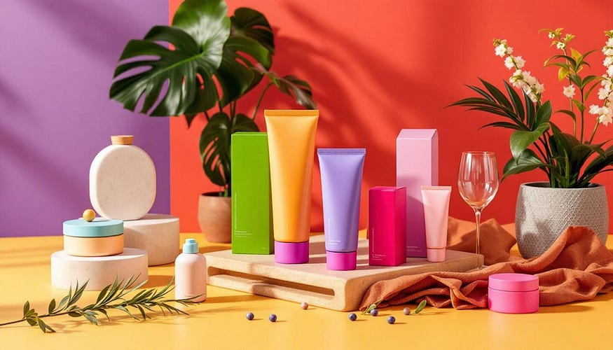
How Different Colors Influence Customer Perception
While color perception can vary depending on context and culture, certain patterns appear consistently across industries. Brands rely on these patterns when building their identity.
Red — Energy, Urgency, and Action
Red naturally draws attention. It is associated with excitement, movement, and strong emotional responses. It can even stimulate appetite and increase heart rate, which is why it is commonly used in food and entertainment industries.
Brands use red when they want to create a sense of urgency or encourage quick decisions. It is often seen in promotions, sales campaigns, and call-to-action elements.
Blue — Trust, Stability, and Reliability
Blue is one of the most widely used colors in branding, especially in industries where trust is essential. It creates a sense of calm, security, and professionalism.
Financial institutions, healthcare companies, and technology brands often rely on blue because it reduces uncertainty and makes decision-making feel safer.
Yellow — Attention and Positivity
Yellow is bright, noticeable, and emotionally uplifting. It is often associated with optimism and warmth, making it effective for brands that want to appear friendly and approachable.
However, it needs to be used carefully. When overused, it can become overwhelming rather than inviting.
Green — Growth, Health, and Balance
Green is strongly connected to nature, making it a natural choice for brands focused on wellness, sustainability, or organic products.
It creates a sense of balance and calm, but its effectiveness depends on familiarity. When disconnected from what customers already recognize, it can weaken brand clarity instead of strengthening it.
Black — Luxury and Sophistication
Black simplifies and sharpens focus. It removes distraction and directs attention to the product itself.
Premium brands use black to communicate exclusivity, elegance, and high value. It is less about emotion and more about positioning.
Orange — Energy and Approachability
Orange combines the intensity of red with the friendliness of yellow. It feels energetic, confident, and accessible.
It is often used by brands that want to appear bold but not aggressive, making it a popular choice in e-commerce and youth-focused industries.
Why Context Matters More Than Color Itself
One of the most common mistakes in branding is assuming that a color always carries the same meaning.
In reality, context changes everything.
A color that feels exciting in one environment can feel uncomfortable in another. For example, red may work well in a fast-paced retail setting, but in healthcare, it can create tension instead of trust.
Similarly, while blue signals reliability, overusing it in industries where everyone uses blue can make a brand blend in rather than stand out.
Understanding when to follow industry patterns and when to break them is what separates recognizable brands from forgettable ones.
The Real Strategy: Combining Colors, Not Choosing One
Strong brands rarely rely on a single color. Instead, they build a palette that works together to create a consistent emotional experience.
What matters most is not the individual color, but the relationship between colors.
Contrast, balance, and hierarchy all influence how users interact with a design. A well-known example comes from conversion optimization studies, where a simple change in button color increased clicks — not because of the color itself, but because it stood out more clearly within the overall layout.
This highlights an important principle: visibility often matters more than symbolism.
https://medium.com/@fridaymarketing/why-conversations-beat-campaigns-in-b2b-marketing-294f60f1431b
How to Choose the Right Color for Your Brand
Selecting a brand color should never be based on personal preference alone. It requires a structured approach that connects design decisions to business goals.
Start by defining your brand personality in a few clear words. This helps guide your visual direction and keeps your identity consistent.
Next, focus on one primary emotion you want your audience to feel immediately. Whether it is trust, excitement, or calmness, this emotional anchor should influence your color choices.
It is also important to understand your industry. Recognizing common color patterns allows you to decide whether to align with expectations or intentionally stand apart.
Keep your palette simple. Limiting your colors improves recognition and makes your brand easier to remember.
Testing should always be part of the process. Real user behavior often reveals insights that assumptions cannot.
Finally, consider accessibility and cultural meaning. A color that works well in one region or context may not translate the same way elsewhere.
Final Thought
Color is often treated as decoration, something added at the end of a design process. In reality, it should be one of the first decisions a brand makes.
It shapes perception before a single word is read. It builds trust before a product is evaluated. It influences decisions before logic has time to step in.
When used with intention, color does more than attract attention. It defines how your brand is experienced, remembered, and ultimately chosen.


